top of page

An Optimized Experience
A quick look at the improved user flows of the redesigned LA County Shelter website, featuring a cleaner layout, clearer calls to action, and a more intuitive experience throughout.

Calls to Action Made Clear
Say goodbye to busy homepages with vague hero text, these designs put adoption front and center with clear, actionable prompts.
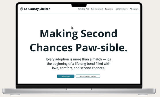
Information at Your Fingertips
Quickly access key details about adoption and fostering without digging through cluttered menus.

Refined Color Palette
A consistent color scheme highlights important information and guides users through the site with visual clarity.
INTRODUCTION
The Breif
This project required redesigning the Los Angeles County Animal Care & Control website to improve its usability, visual clarity, and emotional resonance. The goal was to streamline key user flows for adoption, fostering, and volunteering while making the experience more supportive and accessible for all users.
The Challenge
A 100-hour deadline to re-design the LA County Shelter to prioritize clarity, emotional design, and ease of access for a diverse user base.
My Role
Sole UX/UI Designer, UX Researcher
Timeline
4 Weeks
The Problem
First-time users visiting the LA County Animal Shelter website feel overwhelmed by excessive and disorganized content, making it difficult for them to locate basic adoption or service information quickly.
The Solution
The new interface simplifies navigation, prioritizes key user flows, and introduces a cleaner visual hierarchy. Emotionally supportive content, clear CTAs, and reorganized pages guide users intuitively through adoption, fostering, and volunteering processes.
.png)

Adoption Across the Web: How Other Shelters Guide Their Users
To guide my redesign, I analyzed animal shelter and public service websites to benchmark usability, identify best practices, and spot gaps in navigation, tone, and visual clarity—helping shape a more intuitive and welcoming experience for LA County users.

01. Clear Visual Hierarchy
02. Consistent Design
03. Successful Story-telling Elements
Fetching Insights: What Our Users Really Want
To understand how first-time and returning users experience the LA County Animal Shelter website and identify pain points in completing core tasks.
APPROACH
Methodology
In-Person & Online.
Number
5 participants
GOALS
01. Understand how users locate and navigate adoption, fostering, and volunteering flows.
02. Identify barriers to emotional clarity and trust in the interface.
Duration
15- 20 minutes.
Age
19-46 years old
03. Assess the usability of the current pet search and homepage structure.
QUESTION STRATEGY
01. Discussion of General Expectation
02. Reflection on their emotional impressions
03. Addressing what was confusing, helpful, or frustrating.
Affinity Mapping

With the findings from my user interviews, I produced an affinity map to look for any patterns or themes which started to emerge. Based on the information gathered, I began grouping it into three main categories:
Key Findings
.png)
01. Confusing Navigation Structure
-
5/5 had trouble - Locating key pages (Adoption, Foster, Volunteer).
-
Dropdown menus were overly sensitive or unclear.
02. Visual Clutter & Poor Information Hierarchy
-
4/5 said the homepage was too text-heavy or overwhelming.
-
Important actions were buried under less relevant content.
03. Ineffective Pet Search Functionality
-
4/5 found filters unintuitive; cards lacked summary info (age, breed, personality).
Define
Designing for Every Visitor
.png)
Based on these patterns, I created a user persona:
Anna (first-time adopter and parent) . This persona helped focus design decisions on accessibility, ease of use, and emotional connection.
Ideate
Brainstorming Solutions
With user needs and pain points clearly outline, I now can outline and plan solutions. After brainstorming and looking at potential market research, I decided on the following key needed features.
Oppurtiny Areas
Homepage Adjustments
Clear CTAs for Adopters
Pet Cards
Streamlined homepage with clean CTAs
Dedicated "Adoption Info" and "Adoptable Pets" pages
Scannable pet cards with filters
Navigation Menu
Empathetic Messaging
Simplified navigation and sticky menu
Refreshed volunteer/foster sections with emotional messaging
MVP Feature Set
Visualizing their current journey allowed me to pinpoint how and when pain points arise, which revealed the importance of a candidate comparison feature and guided the design direction:
.png)
User Flow
To restructure information architecture and ensure each user journey is simple and goal-oriented. Flows were based on core tasks: adopting, fostering, and volunteering.
.png)
Lo Fi-Wire Frames
From Ruff to Refined: Wireframing the Path Forward
I began with hand-drawn sketches and iterated on multiple variations of homepages and subpages to test navigation clarity, visual balance, and emotional tone.


I focused on content clarity to prioritize readability and emotional resonance. This allowed me to create wireframes that supported the real-world needs and mental models of users.
Design and Branding
.png)
Validate
Usablility Testing
Now that we had a good idea of how the information would be organized on the screen, I began conducting usability tests. The primary goal of this usability test was to identify areas where users experienced uncertainty, encountered design issues, or felt overall confusion.
APPROACH
Methodology
In-Person & Moderated.
Number
5 participants
Duration
20 minutes.
Age
18 - 53 years old.
GOALS
01. Validate concept & design decisions.
02. Measure task completion.
03. Discover potential usability issues.
04. Evaluate effectiveness of comparison feature.
OBJECTIVES
Objectives:
Pass/Fail:
Measurable Results:
Evaluate if the Homepage was clear and easy to navigate
5/5
5/5 found it clear and easy to navigate.
Evaluate if navigating to the Adoption Info page is clear and intuitive.
4/5
4/5 found the info helpful but wanted it linked from the gallery.
User can easily find an animal they want to adopt using the search filters.
5/5
5/5 found the design effective; filters were clear.
User can easily find the Adoption Page, and find it easy to navigate
4/5
4/5 found content approachable; 1 noted text could be more spaced.
User can easily find the Foster Page, and find it easy to navigate
5/5
5/5 understood the difference from adoption and felt motivated.
Before & After: Transforming the Experience
01. Home Page


02. Informational Pages


03. Adoption Search


The Final Product: Click. Scroll. Adopt.

Video Demo:

Reflections
Why This Topic?
I chose to redesign the LA County Animal Shelter site because I care deeply about animal welfare and know how stressful it can be to lose or adopt a pet. The emotional urgency of these user scenarios made this an ideal UX challenge.
Why This Project Challenged Me:
Designing for a real government system meant considering accessibility, tone, and visual clarity without overwhelming or overpromising. It required balancing emotional design with logistical accuracy.
Growth as a Designer:
This project deepened my skills in research synthesis, content strategy, and accessibility-driven UI. I learned how to advocate for emotional clarity in public service design while staying user-focused from start to finish.
bottom of page